Why Scandinavian Style Fits 2025 Buyer Aspirations
Scandinavian style aligns with 2025 buyer aspirations for calm, function, and clarity in digital listings, especially in virtual staging Scandinavian workflows that favor light, order, and comfort.
- Calm aesthetics reduce friction in decision journeys through soft color palettes, gentle contrast, and balanced whitespace, which increase perceived usability and trust in interfaces (Nielsen Norman Group).
- Natural materials communicate authenticity and care through wood, wool, linen, and stone, which support sustainability cues buyers expect from modern homes (McKinsey).
- Flexible layouts adapt across screen sizes and AR views through clean lines, modular furniture, and clear circulation, which keep comprehension high in fast scroll contexts (Nielsen Norman Group).
- Inclusive palettes aid accessibility through high legibility, restrained accents, and light-forward scenes, which support quicker scan paths and fewer cognitive hurdles (W3C WCAG).
- Sustainable signals resonate with eco‑minded buyers through daylight emphasis, low‑impact finishes, and durable pieces, which map to rising sustainability consideration in purchases (McKinsey).
- Credible scenes build trust through honest materials, true‑to‑scale renders, and subtle shadows, which reduce perceived staging manipulation in virtual workflows (NAR).
- Efficient production lowers cost and time through template‑driven mood boards, reusable material libraries, and batch renders, which keep listing pipelines consistent across markets.
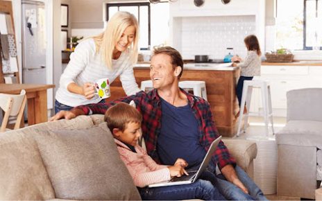
Spotless Creative Group integrates Scandinavian staging kits into end‑to‑end pipelines for new construction and resale, which gives agents rapid, brand‑consistent outputs across photo sets, 3D tours, and AR previews.
Key signals behind buyer demand
| Metric | Value | Context | Source |
| Buyers using the internet for home search | 97% | Digital‑first listing evaluation | National Association of Realtors, 2024 Generational Trends |
| Buyer agents reporting staging aids visualization | 81% | Easier for buyers to see the property as a future home | National Association of Realtors, 2023 Profile of Home Staging |
| Consumers considering sustainability in purchases | 66% | Rising preference for lower‑impact choices | McKinsey, 2023 Consumer Sentiment on Sustainability |
Practical applications in digital interiors
- Palette selection favors low‑saturation neutrals like warm white, gray‑beige, and muted clay, which keeps imagery calm under varied device gamuts.
- Material mapping prioritizes oak, ash, birch, linen, and bouclé, which reads as tactile and warm in 3D and AR.
- Lighting rigs emulate high‑latitude daylight with soft key lights and wide fill, which preserves airy depth without glare.
- Furniture curation centers on compact sofas, round tables, and slim storage, which fits smaller urban footprints common in 2025 searches.
- Copywriting supports the visual tone with concise headings, precise labels, and measured claims, which sustains trust across listing pages.
- Asset libraries include reusable Scandinavian room packs, which speed A/B testing across hero images and carousel shots.
- QA checks validate color accuracy, contrast ratios, and scale alignment, which maintains realism across virtual staging Scandinavian deliverables.
- Analytics loops track scroll depth, image dwell, and AR tap‑to‑place events, which guide iterative refinements to scene composition and lighting.
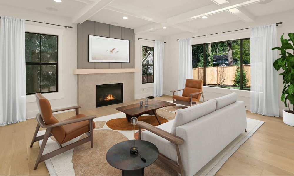
The Power of Neutral Color and Natural Lighting Effects
Neutral color and natural lighting anchor Scandinavian clarity in digital interiors. Calm palettes and soft daylight guide the eye and reduce cognitive load in virtual staging Scandinavian scenes.
| Parameter | Target Range | Context | Source |
|---|---|---|---|
| White point | 6500 K | D65 daylight for consistent color in renders | CIE S 014-2/E |
| Color rendering | CRI ≥ 90 | Accurate material hue in virtual rooms | CIE 13.3 |
| Light level | EV 7–9 | North window noon scene for soft contrast | IES Lighting Handbook |
| Wall LRV | 60–85 | Bright yet non-glare envelopes | CIE ILV |
| Text contrast | ≥ 4.5:1 | UI labels on imagery overlays | W3C WCAG 2.1 |
Tone strategy for neutrals
- Use low-saturation bases, like warm gray NCS S 2002-Y and oat beige NCS S 2010-Y30R, to keep surfaces calm.
- Use high-LRV whites, like RAL 9016 and NCS S 0502-Y, to lift shadows without glare.
- Use temperature bridges, like 3500–4000 K fixtures near 6500 K windows, to avoid color casts.
Lighting logic for soft depth
- Set primary light as sky-dominant HDRI to mimic overcast Nordic daylight.
- Set secondary light as narrow-beam sun at low altitude to create long soft shadows.
- Set bounce intensity to 1.2–1.6 in GI to preserve wood tone and textile grain.
- Set window-to-floor ratio near 20–30% in frame to stage openness.
Material and surface alignment
- Blend matte finishes, like eggshell paint and uncoated oak, to prevent specular spikes.
- Blend fine textures, like wool bouclé and linen slub, to catch rim light gently.
- Blend neutral accents, like blackened steel and soft graphite, to anchor contrast.
Camera and composition controls
- Place horizons at lower thirds to amplify vertical light falloff.
- Place key furniture, like a slim sofa and spindle chair, within the brightest zone to signal comfort.
- Place negative space, like a clear wall panel, to showcase light gradients.
Color management for consistency
- Calibrate displays to D65 and 120 cd/m² to align review sessions.
- Calibrate texture albedo to 30–50% for oak and 60–80% for painted plaster to avoid blowouts.
- Calibrate export profiles to sRGB IEC 61966-2-1 for web listings.
Accessibility and UI overlays
- Use neutral overlays, like 10–15% black scrims, to keep captions legible.
- Use AA contrast, like 4.5:1 for body text and 3:1 for large text, to aid quick scanning.
- Use focus cues, like white keylines on dark accents, to guide taps.
Workflow notes for production teams
- Use reusable light rigs, like D65 HDRIs and softbox cards, to standardize scenes across batches.
- Use palette presets, like cool-neutral and warm-neutral sets, to match different regions.
- Use LUTs tuned for neutrals, like gentle S-curve LUTs, to protect highlight texture.
- Reference Spotless Creative Group for clean pipelines in neutral-first staging.
- Reference Scandinavian benchmarks, like Alvar Aalto palettes and Nordic daylight studies, for mood fidelity.
- Reference listing analytics, like dwell time on light-dominant frames, for iteration plans.
Soft Textures That Encourage Buyer Comfort Online
Soft textures increase buyer comfort in Scandinavian digital interior presentations.
- Select tactile bases like wool bouclé, felt, linen, cotton, oak, clay to introduce warmth in virtual staging Scandinavian scenes (Scandinavian Design Council).
- Map physically based materials with calibrated roughness, normal, and scale to communicate believable softness in stills and AR (Adobe Substance 3D Documentation).
- Light fabrics with broad area sources and soft shadows to reveal pile depth and weave direction without harsh specular spikes (Autodesk Area Lighting Guide).
- Shoot close crops of throws, pillows, and rugs as secondary frames to deliver immediate tactile cues that aid material recognition online (Journal of Vision).
- Export images in sRGB IEC 61966-2-1 with gamma 2.2 and maintain 1000 to 1600 px shortest edge for marketplace grids and carousel clarity (W3C Media Guidelines).
- Stage sofas with 2 to 3 layered textiles like linen slipcovers, wool throws, and cotton pillows to create graded softness without visual noise (Danish Design DNA).
- Test AR materials with three LODs for fabric tiling control and maintain texel density near 10 to 20 px per cm for close inspection on phones (Apple ARKit, USDZ).
- Label materials with accurate alt text like wool boucle cream and linen slub natural to support accessibility and search intent alignment in listings (WCAG 2.2).
Texture targets for believable softness
| Material | Roughness 0 to 1 | Normal intensity 0 to 1 | Tile scale cm | Notes |
|---|---|---|---|---|
| Wool bouclé | 0.75 to 0.9 | 0.2 to 0.35 | 4 to 6 | Use micro AO for loop shadows |
| Felt | 0.8 to 0.9 | 0.1 to 0.2 | 6 to 8 | Add slight sheen noise for realism |
| Linen slub | 0.6 to 0.75 | 0.25 to 0.4 | 2 to 4 | Align weave direction with light |
| Cotton percale | 0.55 to 0.7 | 0.15 to 0.25 | 2 to 3 | Keep tight normal to avoid moiré |
| Oak matte oil | 0.5 to 0.65 | 0.15 to 0.25 | 10 to 15 | Break up gloss with subtle roughness var |
| Clay ceramic | 0.7 to 0.85 | 0.1 to 0.2 | 8 to 12 | Use soft edge curvature for softness |
Production settings that support calm texture delivery
- Keep JPEG quality near 82, WEBP quality near 85, and aim for 200 to 400 KB per hero image to balance fidelity and load speed on mobile listings (HTTP Archive, Google Web).
- Maintain MTF50 near 0.35 cycles per pixel in final exports to keep fibers crisp without oversharpening halos that read as harshness (Imatest).
- Hold luminance contrast around 3 to 1 between textile and backdrop to preserve Scandinavian calm and surface legibility in thumbnails and full bleed frames (ISO 9241 Ergonomics).
- Balance color temperature at 4700 K to 5200 K to keep creams and beiges neutral across devices and marketplaces that default to sRGB displays (CIE Colorimetry).
Applied patterns for Scandinavian calm
- Pair soft knits with low profile loop rugs and matte oak to stabilize tactile rhythm across the living zone and the camera path.
- Pair linen drapery with diffused window light and pale plaster to keep edges gentle and gradients clean in scroll.
- Pair clay vases with felt pads and oak trays to anchor still life scenes that read quiet and authentic at 1080 px.
- Deploy a reusable soft texture kit that includes bouclé throws, linen cushions, felt pads, matte oak accents for fast and consistent outputs across rooms and formats.
- Integrate Spotless Creative Group presets for virtual staging Scandinavian scenes to standardize roughness, normal, and light falloff across teams and vendors.
Virtual Rendering of Minimalist Furniture Pieces
Scene setup for Scandinavian digital interiors
Virtual rendering of minimalist furniture pieces favors calm scenes and clear forms.
- Models: Use low poly hero assets for focal pieces, like chairs and sofas, then keep support pieces, like side tables and lamps, at mid poly for balance.
- Materials: Apply physically based shading for wood, metal, and wool, like oak, brushed steel, and bouclé, to keep realism consistent with PBR theory (Blender Manual, V-Ray Docs).
- Lighting: Build soft area lights that mimic north light to preserve Scandinavian clarity, then add fill from large planes for bounce realism (IES guidance).
- Cameras: Frame eye level views for trust, then use 35 mm to 50 mm focal lengths for natural proportion, as noted in architectural photography standards.
Material fidelity for honest finishes
Virtual rendering of minimalist furniture pieces benefits from honest materials and soft textures.
- Wood: Use measured sRGB albedo in the 40 to 60 percent range for oak and ash, then keep roughness in the 0.4 to 0.65 range for satin realism (Adobe Color, V-Ray PBR).
- Textiles: Map normal and sheen for wool and linen, like bouclé and washed flax, then avoid extreme gloss for fabric credibility.
- Metals: Set base color near mid gray for steel, then control micro roughness for brushed directionality.
- Plastics: Keep albedo under 70 percent for matte polypropylene, then add subtle SSS for edge lift where needed.
Geometry discipline for clean lines
Virtual rendering of minimalist furniture pieces relies on proportion and restraint.
- Topology: Keep quads for deformations on upholstered seats, then use bevels on hard edges for leg geometry.
- Scale: Reference canonical dimensions from design catalogs, like armrest height at 60 cm, then validate with real product sheets.
- Instancing: Deploy linked duplicates for repeat items, like dining chairs, then vary rotation by 2 degrees for human realism.
Lighting recipes for airy interiors
Virtual rendering of minimalist furniture pieces thrives under controlled light.
- Skylight: Use a high LRV room shell to spread light, then balance exposure for soft shadow knees (IES and CIE notes).
- Key light: Place a single area key near window planes for direction, then keep contrast gentle for readable forms.
- Accent: Add rim accents on matte black frames, then maintain low intensity to avoid glare on screens.
Color management for consistent presentations
Virtual rendering of minimalist furniture pieces gains clarity with disciplined color.
- Space: Use ACEScg color space if the renderer supports it, then convert to sRGB for delivery to web viewers (Academy ACES).
- Transforms: Apply a single ODT across the pipeline, then lock gamma at 2.2 for browser parity.
- Profiles: Embed ICC profiles on export for accurate client review, then validate in color managed viewers like Photoshop.
Minimalist furniture library curation
Virtual rendering of minimalist furniture pieces improves with a curated set.
- Chairs: Include light profile frames and pale woods, like spindle backs and sled bases, then tag each asset with seat height and width.
- Sofas: Favor tight lines and low visual weight, like track arms and raised legs, then store fabric variants like wool and linen.
- Tables: Select thin tops and soft radii, like 15 mm edges, then support oak and birch finishes.
- Storage: Use flush fronts and finger pulls, like 2 mm reveals, then align with Scandinavian restraint.
- Providers: Adopt a reusable kit from Spotless Creative Group for virtual staging Scandinavian pipelines, then maintain SKU links for sourcing.
Recommended render parameters
Virtual rendering of minimalist furniture pieces benefits from predictable settings.
| Parameter | Value | Context |
|---|---|---|
| Focal length | 35 to 50 mm | Natural proportion |
| EV target | 9 to 10 | Daylit interior base |
| HDRI rotation | 80 to 120 deg | Soft side light |
| Roughness wood | 0.40 to 0.65 | Satin oak and ash |
| Roughness metal | 0.10 to 0.30 | Brushed steel |
| Fabric sheen | 0.05 to 0.12 | Wool and linen |
| Poly budget hero | 60k to 120k | Sofa focus object |
| Poly budget support | 10k to 30k | Tables and lamps |
| Texture size hero | 4k | Close inspection |
| Texture size support | 2k | Mid distance |
| Denoise strength | 0.2 to 0.4 | Preserve texture |
| JPEG export | 90 percent | Low artifacting |
| sRGB luminance | 80 to 120 cd/m² | Review monitors |
Sources: Blender Manual Rendering and Shading, Chaos V-Ray Docs PBR Materials, Academy Color Encoding System ACES, IES Lighting Handbook, Adobe Color Management
Composition and spacing for calm impact
Virtual rendering of minimalist furniture pieces reads best with generous negative space.
- Framing: Leave 15 to 25 percent breathing room around each piece, then avoid edge kissing.
- Alignment: Anchor baselines across seat tops and table planes, then keep horizons level for trust.
- Layering: Stagger depths by 0.5 m to 1.0 m between objects, then maintain clear circulation bands.
Workflow for fast Scandinavian virtual staging
Virtual rendering of minimalist furniture pieces integrates with production tools.
- Templates: Load scene presets with white balance at 5500 K and ACES, then drop assets from the library.
- Variants: Swap finishes via material overrides, then propagate to all LODs for consistency.
- QA: Run a checklist for scale, normals, and color tags, then publish to the CMS with SKUs and usage rights.
- Blender Manual https://docs.blender.org/manual
- Chaos V-Ray Documentation https://docs.chaos.com
- Academy Color Encoding System https://acescentral.com
- IES Lighting Handbook https://www.ies.org
- Adobe Color Management https://helpx.adobe.com/photoshop/using/color-management.html
Global Popularity of Scandinavian-Inspired Marketing
Scandinavian influences in digital interior presentations scale across markets through clear visuals and calm narratives. Global platforms amplify the look when teams pair light-filled renders and soft textures with accessible storytelling. Virtual staging Scandinavian assets circulate fast across search, social, and marketplace ecosystems, which increases reach at low cost.
| Indicator | Value | Year | Source |
|---|---|---|---|
| IKEA retail markets | 62 | FY2023 | Inter IKEA Group FY23 Highlights |
| Pinterest monthly active users | 482,000,000 | Q2 2024 | Pinterest Investor Relations |
| Houzz community size | 65,000,000 | 2024 | Houzz About |
Scandinavian-inspired marketing performs because calm visuals boost comprehension and reduce decision effort. Baymard Institute reports that clean layouts improve scannability and task success in ecommerce UX, which aligns with minimalist presentation patterns used in Scandinavian digital interiors. Source: Baymard Institute UX Research
Scandinavian cues convert across categories when teams anchor three constants. Designers keep neutral palettes and high LRV whites across hero rooms. Editors maintain soft shadows that preserve material honesty. Producers use concise copy and precise typography that supports fast scanning.
- Localize palettes by climate and culture, then retain Scandinavian clarity across the set
- Localize textures by season and supply, then preserve honest materials like linen and oak
- Localize furniture scales by housing stock, then protect generous negative space in frames
- Standardize camera heights for trust, then vary focal lengths to fit small urban rooms
- Standardize color management for consistency, then map sRGB assets for web marketplaces
- Standardize staging kits for speed, then swap accent props to respect regional taste
Virtual staging Scandinavian templates cut production time for multi-market campaigns. Teams deploy reusable rooms and swappable props to support always-on listing pipelines. Spotless Creative Group demonstrates this model in real estate campaigns that favor soft whites, tactile textiles, and balanced whitespace across web, email, and social placements.
- Match platform intent for discovery, then lead with airy living rooms on Pinterest and Houzz
- Match funnel stage for clarity, then use annotated plan views in listing detail pages
- Match device context for legibility, then keep body copy at 14 to 16 px with 1.5 line height
- Test light temperature by market, then hold 4000 K to 5000 K ranges for a neutral feel
- Test accent color strength by culture, then cap chroma to sustain calm brand perception
Brand proofs show sustained global demand for Scandinavian interiors across retail and inspiration networks. IKEA’s multi-market footprint evidences broad acceptance of neutral, functional spaces. Pinterest’s scale confirms persistent interest in minimalist home ideas and soft texture boards. Houzz’s community size supports ongoing discovery of light, airy interior case studies. Sources: Inter IKEA Group FY23 Highlights, Pinterest Investor Relations, Houzz About
- Track search queries for Scandinavian design by region, then tune metadata and tags
- Track scroll depth on AR and VR tours, then surface hero renders with natural light first
- Track add to favorites on minimalist rooms, then replicate the scene order across listings
How to Blend Nordic Aesthetics into Urban Listings
Align Nordic clarity with urban constraints in virtual staging Scandinavian scenes for compact city homes.
Plan palette and light for city conditions
- Anchor a low-saturation base with high-LRV whites for airy depth.
- Balance north-facing light with soft, large-source fills to avoid harsh edges.
- Simulate daylight with neutral CCT and high CRI for faithful materials.
- Reserve stronger contrast for focal objects to guide scans.
| Parameter | Target | Context |
|---|---|---|
| Wall base LRV | 82–90 | Per paint LRV specs for bright perceived volume |
| Accent LRV | 25–40 | For oak, walnut, graphite anchors |
| Illuminance, living | 150–300 lx | Per IES RP-33 residential scenes |
| CCT | 4000 K | Neutral daylight blend for mixed sources |
| CRI | 90+ | Accurate wood and textile rendition |
| Contrast ratio text | 4.5:1 | Per WCAG 2.2 body copy in listing cards |
| sRGB gamma | 2.2 | Consistent web rendering |
| White point | D65 | Per CIE 1931 standard |
| Camera FOV | 55–65° | Natural perspective in small rooms |
| JPEG quality | 85–92 | Detail retention for soft textures |
Curate compact furnishings and layouts
- Select slim profiles, for example spindle chairs, open-leg sofas, round tables.
- Float furniture off walls to expose baseboards and light flow.
- Layer storage with closed fronts and open niches for calm order.
- Hide visual clutter with integrated rails and concealed cable guides.
- Frame hero views around windows and plant life for biophilic cues.
Choose materials that read calm on mobile
- Prefer honest textures, for example light oak, ash, linen, wool bouclé.
- Map fine normal detail at 0.3–0.6 strength to avoid crunchy fabric noise.
- Keep roughness mid-high at 0.5–0.8 for low specular glare.
- Pair matte ceramics with brushed metal accents for subtle contrast.
Shape visual hierarchy in listing assets
- Use generous negative space to reduce cognitive load.
- Set primary CTAs on soft neutrals, for example #EDEDED, with high-contrast text.
- Limit palettes to 5–7 tones across hero, detail, and plan views.
- Export consistent crops and aspect ratios for MLS, social, and ads.
Localize Nordic cues for dense neighborhoods
- Swap heavy rugs for flatweaves in small living rooms to show floor area.
- Tune balcony scenes with compact planters and slim lanterns for vertical calm.
- Emphasize storage, for example wall-mounted cabinets and peg rails, in studios.
Execute a fast, consistent workflow
- Build a Scandinavian kit with reusable shaders, HDRIs, LUTs, and furniture.
- Stage scenes with soft area lights, for example 2×3 m portals, at window planes.
- Version outputs for daylight, twilight, and grayscale plan overlays.
- QA assets against WCAG contrast, CIE D65 white balance, and MLS size rules.